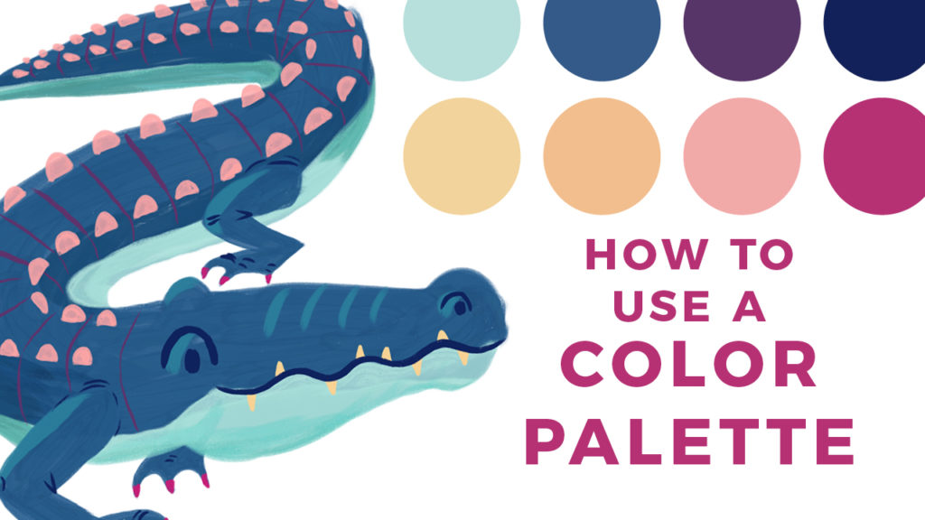
Working from a Color Palette
In illustration, the simplest way to approach color is to draw what you see in real life. But what if you want to take your artwork beyond the conventional when it comes to color? Where do you begin?
Scenario: You found a color palette that has you inspired to sit down and make some art. You sketch out your illustration and then…what do you do next? How do you know what colors to put where? How do you know what colors will actually look good next to each other? A beautiful color palette can still look awkward if the colors aren’t used effectively.
Color beyond the Obvious
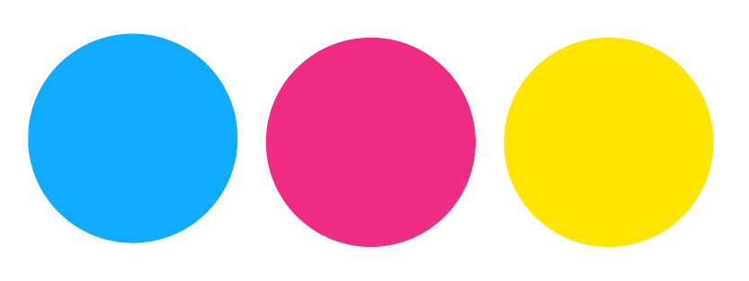
Many unique and striking images push the envelope when it comes to color. In this tutorial, I’ll show you how to use a color palette and apply it to an illustration. You learn what qualities to look for in a color palette. I’ll show you a quick exercise to help you plan your coloring and how to choose where to use the different colors in your artwork. At the end of this article, you’ll find a Pinterest board I made for you that is filled with a ton of inspirational out-of-the-ordinary colors, like the ones below. Let’s go!
Step-By-Step
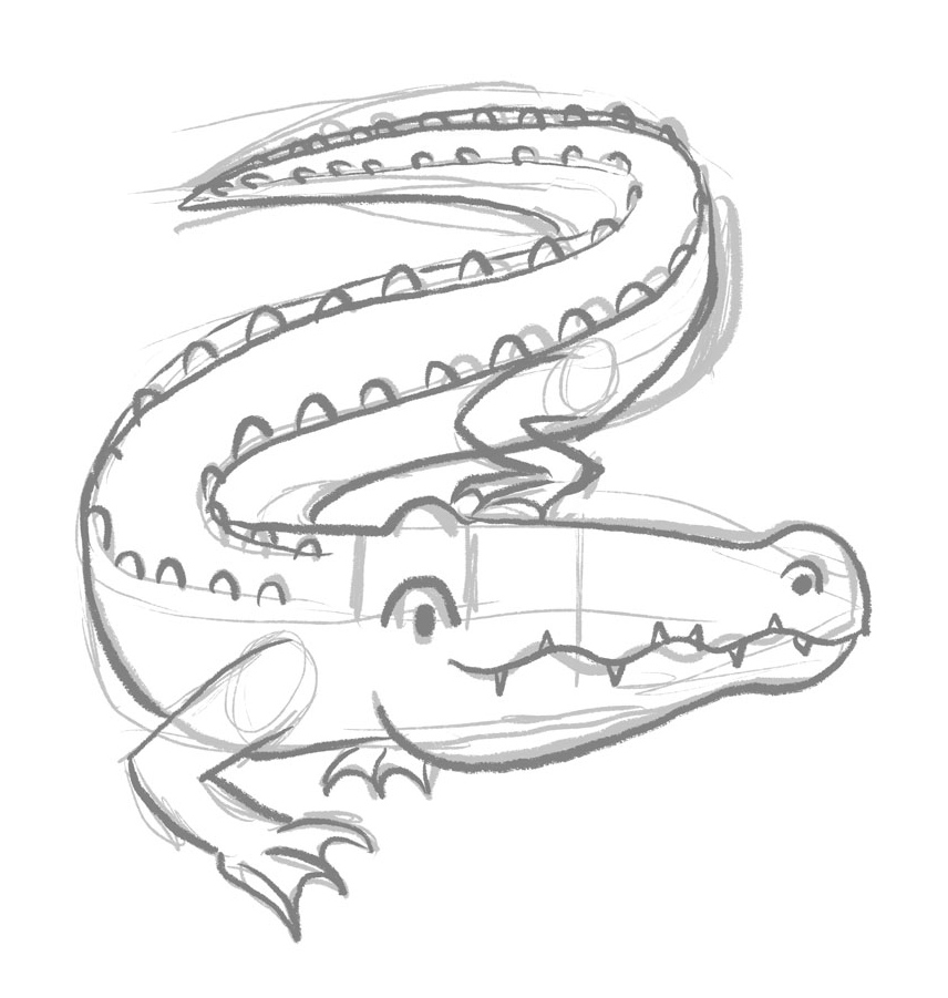
1. Start with a Sketch
Sketch out your composition. Refine the sketch so that you have clearly defined areas you’ll use to help plan out your colors.
2. Choose a Palette
I’d recommend a palette with a limited number of HUES (no more than 3) and that includes some lighter and darker VALUES.
Hue:
Unique positions on the color spectrum. Hue is what comes to mind when you traditionally think of different “colors.” Think blue, green, yellow, orange, red etc.
Value:
The lightness or darkness of a color or hue. Think maroon vs. pink, each is a value of red.
I decided to choose a Procreate color palette I made called “Soothing Seconds.” It’s limited in hues, mostly blues and magentas, and includes a few different color values — LIGHT: aqua, peach, etc. MEDIUM: blue, magenta, etc. and DARK: navy, dark purple, etc.

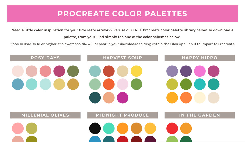
You can find this palette and dozens of others in my FREE Procreate Color Palette Library.
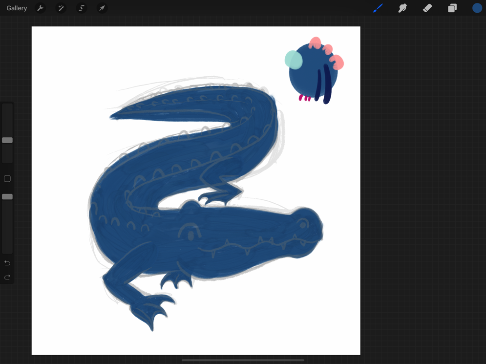
Choose one swatch to be your dominant color. This is the color you’ll use more than any other color in your drawing. Most of the time, it’s a good idea to choose a medium value, as you’ll need to be able to include highlights and shadows. For my alligator, I decided to use the medium blue as my dominant color.

3. Make a Color Plan
In this step, you’ll see the way your different colors will interact with each other in a scale similar to your final artwork. It’s a quick way to make sure everything will look good together.
In the corner of your canvas, draw a big swatch of your dominant color. Now start to think about how you can incorporate other colors. I knew I’d need a lighter color for lighter details, so I chose the aqua blue. I drew a small swatch of the aqua overlapping the blue to see how it would look next to the medium blue. Then I figured I’d use the navy for the linework details (since its a darker value), so I drew a couple of lines over the blue swatch. I wondered if the pink could be used for the scales along the back, so I drew some little nubs on the top. Finally, I wanted to work in the magenta somehow. It’s a very intense color, and intense colors call a lot of attention. With that in mind, I decided to use it very sparingly, perhaps on the toenails.
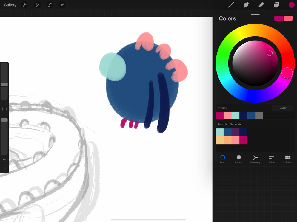
Now I’ve got a good plan for my colors!
4. Get Coloring!
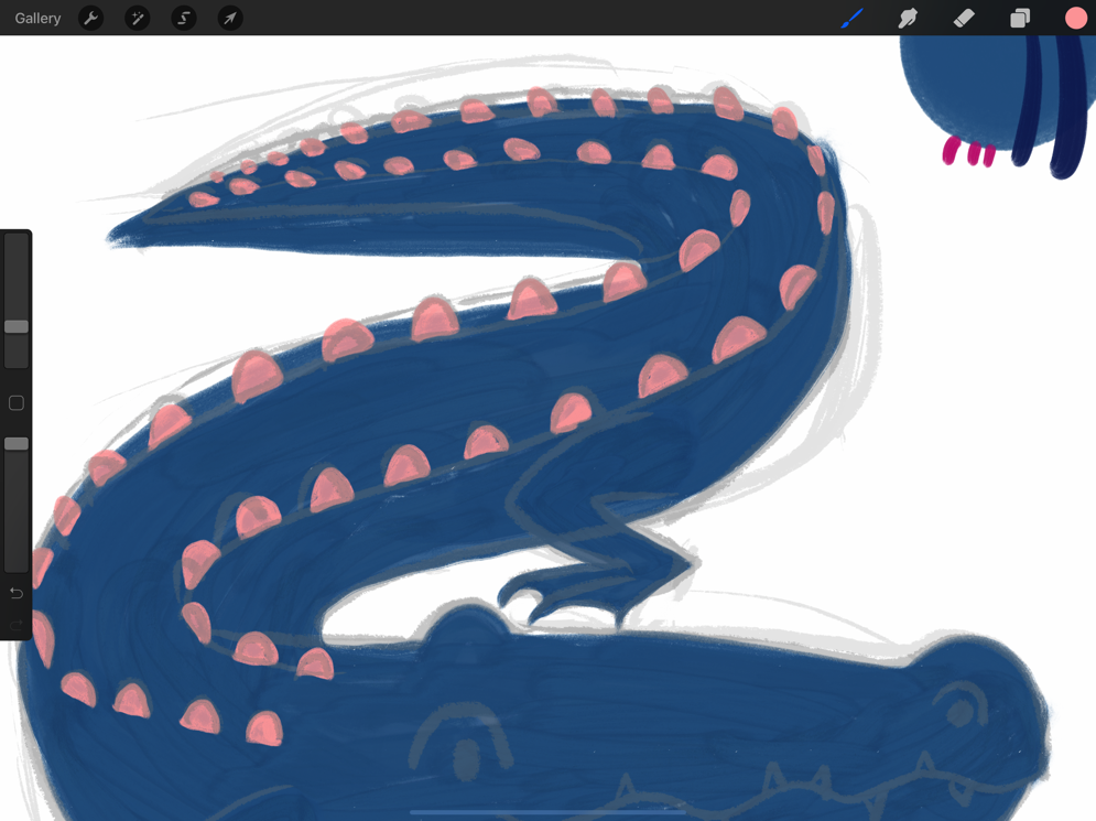
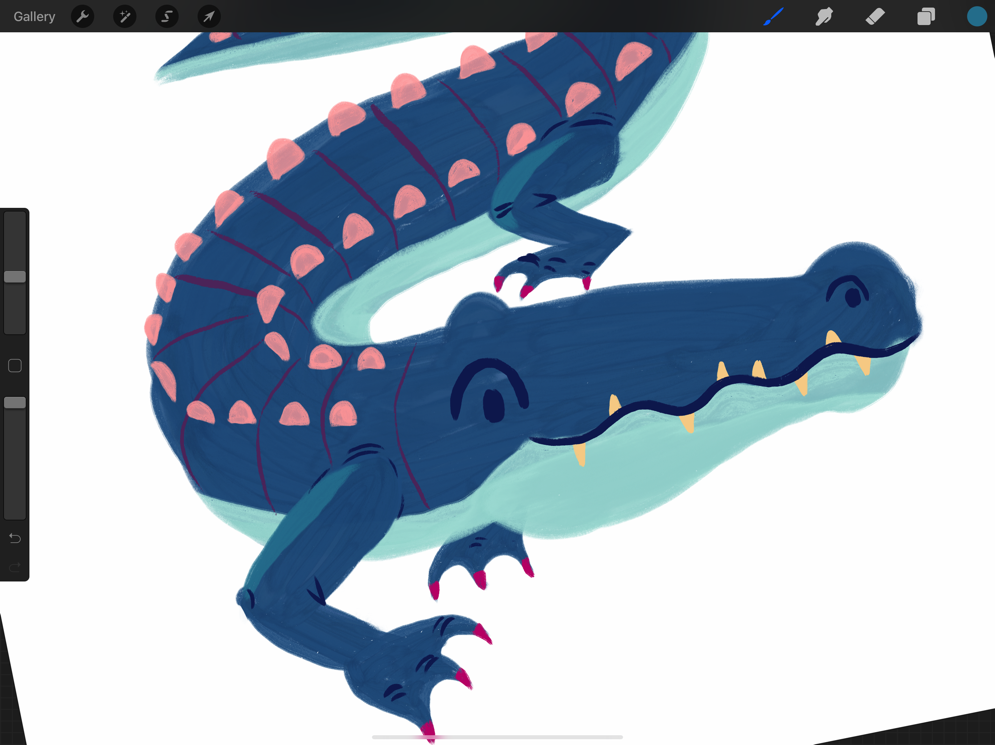
If you are happy with your color plan, it’s time to get to work coloring your sketch. I started by coloring in the body of my alligator with the medium blue.
On a new layer, I drew the back scales in pink. Because the pink is a lighter value than the blue, it pops perfectly.
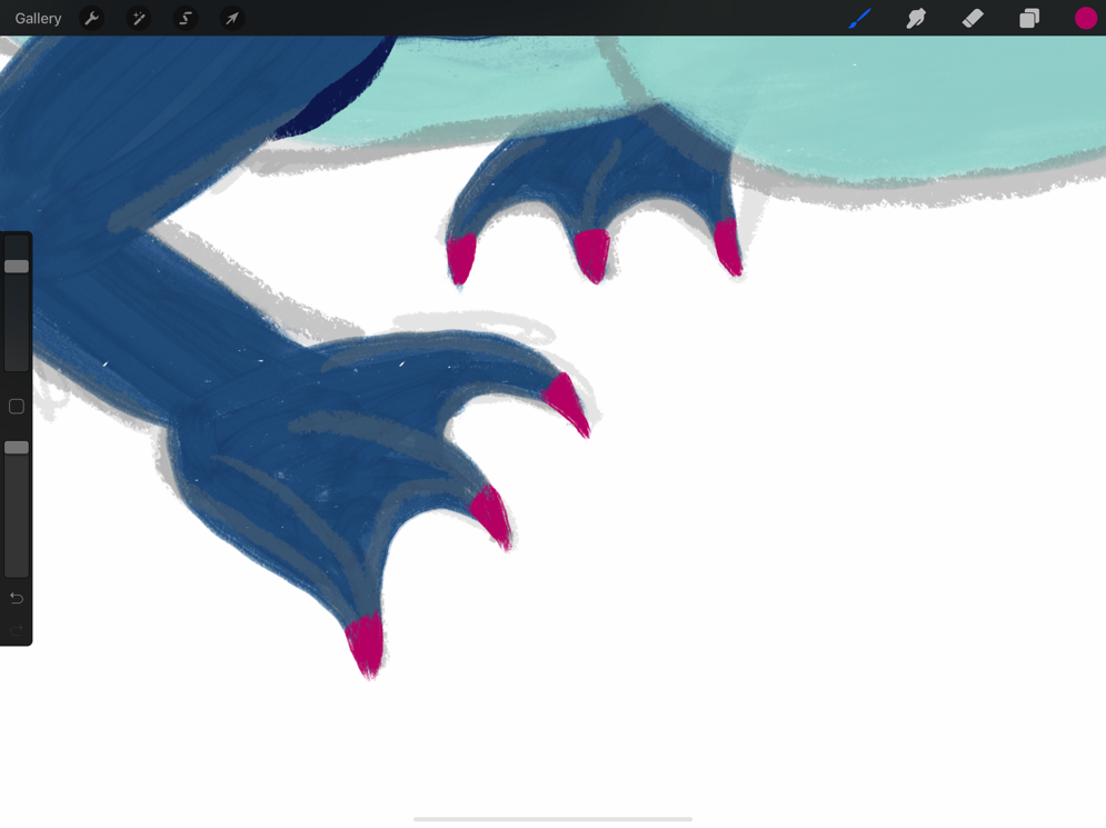
The aqua color became the underbelly of the alligator, and I added the magenta toenails. I also started to add some line details with the navy.
I hadn’t planned a color for the teeth, but I saw the light peachy-yellow in the palette and thought that would look great for teeth. That color is lighter in value than both the aqua and medium blue so that it would be visible against both colors.

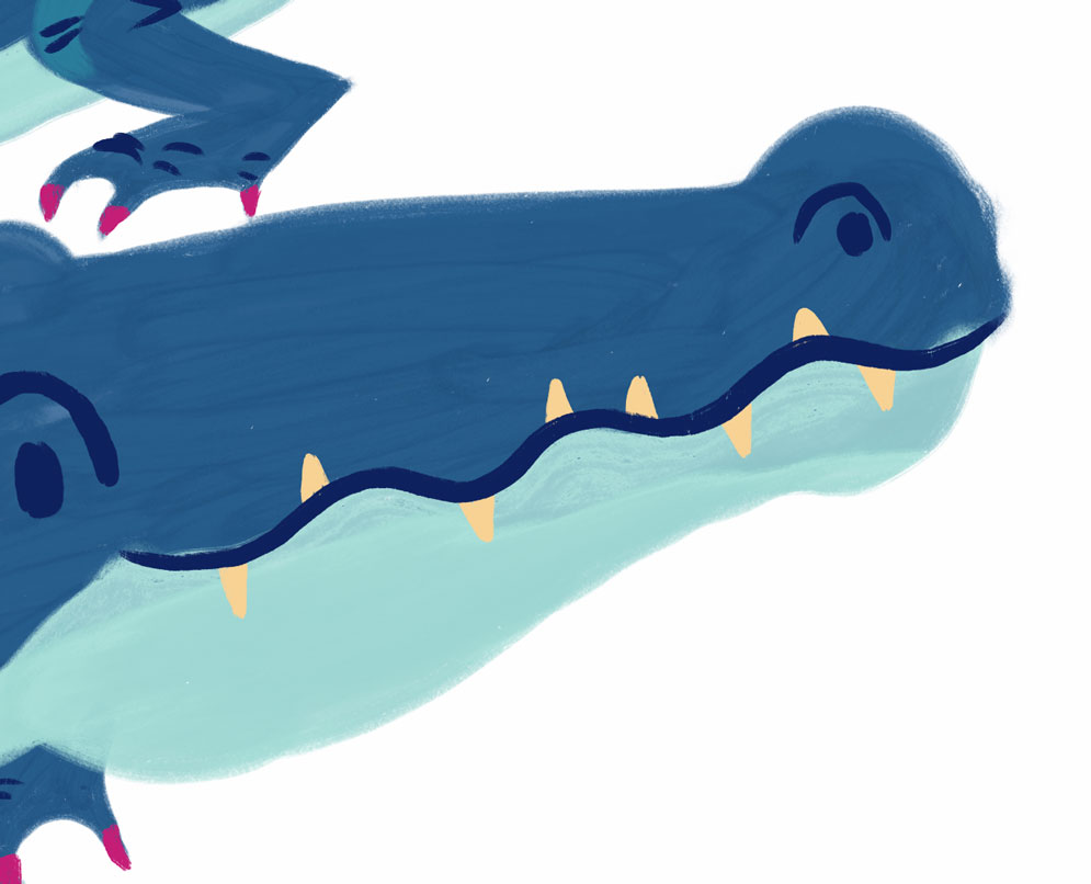
I needed to add some detail lines to the alligator’s back, but didn’t want to use navy again because it was so dark. I saw the medium purple in the palette, so I gave that a try. I was happy with how that looked, but if I disliked it, I could have adjusted the color using the HSB adjustment in the Adjustments menu. I often play around with the HSB sliders when my colors aren’t looking right! For this reason I tend to put different elements (linework, body, legs, details) on separate layers, so they are easier to adjust.
Finally, I decided I wanted to add some highlights to make the legs and other parts stand out more, but my palette didn’t have an appropriate color. So I took the medium blue and, using the color wheel, I chose a color that was just a bit lighter. I decided to also do the same for a couple of shadows on the underbelly by selecting a darker version of the aqua.
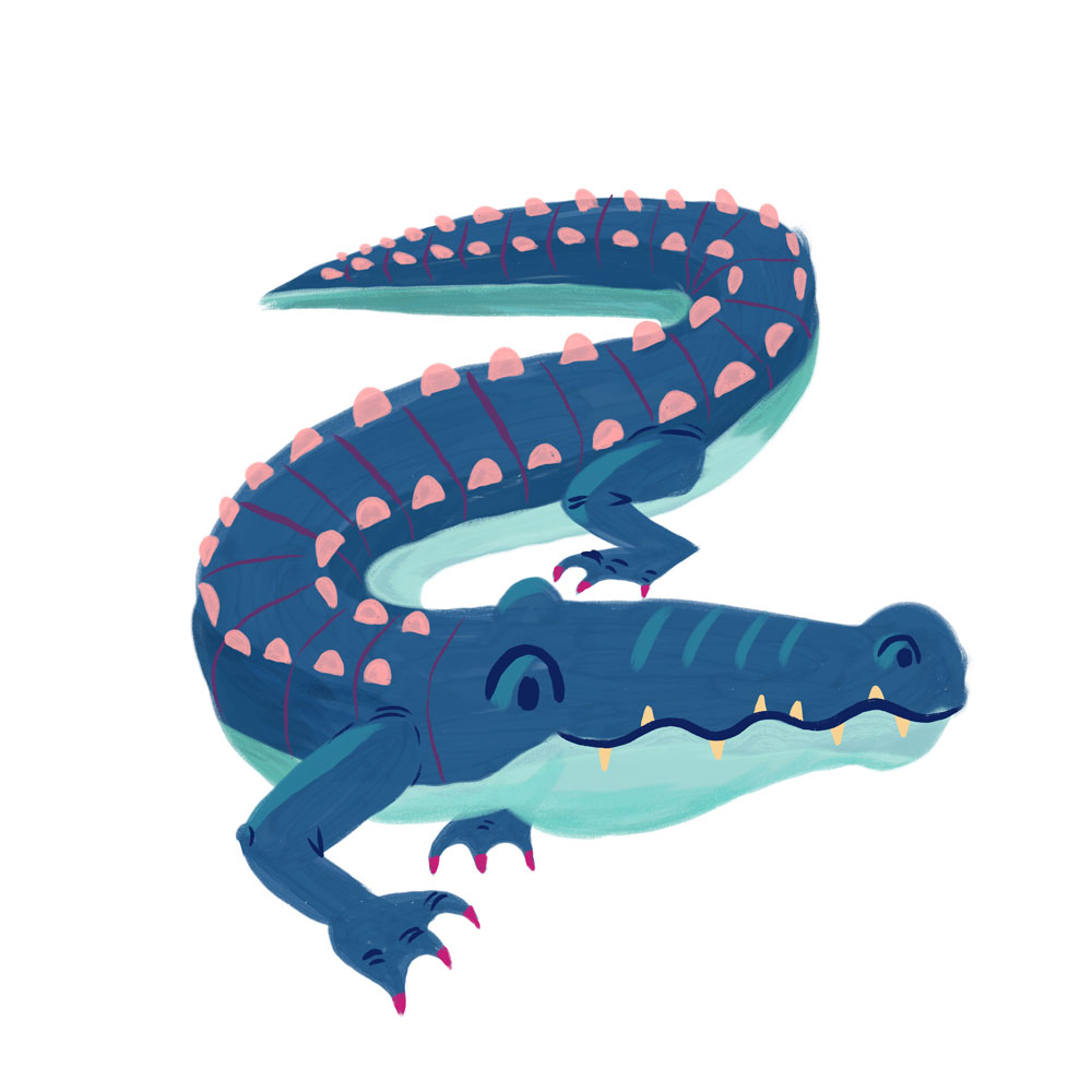
Final Artwork
Here is my finished artwork! To be honest, I’m surprised at how well this turned out. As an artist, I struggle with doing work in “not real” colors. Having a harmonious color palette to start with, and making a color plan before getting to work was incredibly helpful. I hope you have fun playing with color and doing something unexpected!
Additional Resources
Choose from dozens of color palettes created by me. I made these palettes from various images that I found inspirational, so you’ll find lots of fun, bright colors. If you choose one of these palettes for your art, remember you don’t have to use EVERY color in the palette. Choose the ones that work best for your artwork.
I made you a Pinterest Board filled with animal illustrations rendered in unusual color schemes. Use this board to inspire you to make bold color choices!
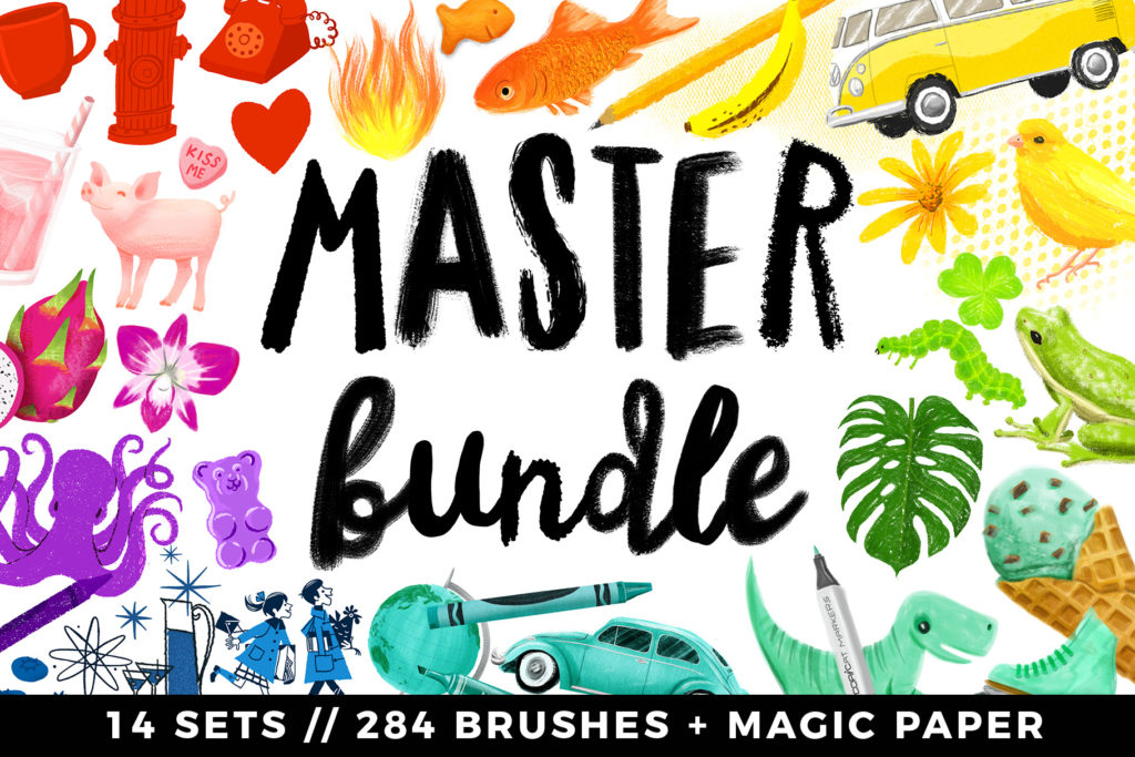
The artwork in this tutorial was made using brushes from my Gouache Paintbox. Find that set and more as a part of my Master Bundle: 14 sets, 284 brushes.
Categories: Procreate Tutorial

This is a really nice tutorial about your color choice process, thank you! And thanks, too, for the lovely color palettes, the challenge to use unexpected colors, and the super-fun Pinterest board – so much creativity everywhere. You really go the extra mile for us, Lisa, and I hope you know how much we appreciate it!
I keep getting amazed every week over how much you give us; superfun challenges, easy tutorials and just that little bit of extra that keeps me coming back for more. It’s really helpful and inspiring! Thank you SO much!
Great tutorial! Thanks for the handy tips, I also struggle with creating all my artwork too realistic, but it’s nice to color outside the box sometimes 😉
I love these palettes! What brush did you use for the body of the alligator? Thanks!
I’d love to know what brush she used too! Either way, great tutorial, thank you! <3333
Thank you! This is so helpful. I am not all that inclined to plan when I am in the creative process and this causes a lot of frustration as I do not get the results I am hoping for. Having colors in mind, ready to go is a step I look forward to adding to my art making. Thx again for all you do and all you share with us.
Great tutorial. Its really helps to think in that way. Make it more please!
This is the best thx!
Glad you liked this!